type, print
The keyword "type" has many different meanings. In this short essay I want to focus on "type" as a medium of printed letters and its evolution over time. Often, movable type is considered the "dead medium", but contrary to this popular belief, printed letters have seen a huge revival over the last two decades and now belong to the realm of modern digital media. The first movable type was invented in China. Primitive clay blocks served as stamps of individual characters. Guttenberg's printing press used the same principle except the type was made out of lead, which allowed for more precise letter shape and greater durability. The machine would print on paper (another Chinese invention passed to Europeans around the 12th century) but the fundamental difference that made Guttenberg's press the more practical was the fact that Latin languages are based on only a few dozen characters (cf notation). The Chinese alphabet contains thousands of glyphs and the task of carving and maintaining the types was too laborious to sensibly replace traditional handwriting.
Together with the compass and the telescope, the printing press is considered one of the mechanical inventions that pushed Medieval Europe into the Renaissance. As Martin Luther showed during the Protestant wars, printed text could be used to spread dangerous propaganda. The effectiveness of printed brochures remains questionable (after all the majority of people could not read at that time) - but the ruling class quickly recognized the power of the printed medium. The question was not how to control the creation of texts (previously kept inside secluded monasteries) but how to be in charge of the distribution. If the pen was mightier than the sword, the politicians had found an even more powerful weapon in the printing press.
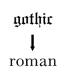 At the same time, new forms of printed letters emerged and the art of typography was born. Initially, typographers tried to copy handwritten letters, but they soon started experimenting with their own designs. One could imagine one standard way of representing letters that would be sufficient to convey the message, but type moved beyond mere communication of ideas to beautification of texts. Printing was no longer a matter of simply reproducing texts but - just like medieval calligraphy - presenting them in an attractive style. Looking at early printed texts, we can see a trend moving away from Gothic letters towards the Roman shape. Roman letters were not only easier to read but, just like in architecture and painting, conveyed a sense of fashion: light and simple Roman lettering symbolized Renaissance while Gothic remained the conservative style.
 The printing press created a gap between printed and handwritten letters. Because moveable types represent individual letters, words created with one pen stroke (so-called script) were very hard to replicate. Script was replaced by italics, and individual letters would never touch again. Many classical fonts such as the Baskerville and Calson, which used to be signature styles of individual typographers - defined what we now perceive as typical printed letters.
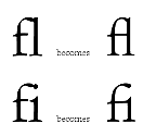 The printing press also changed textual representation by creating new symbols. One interesting example is the ligature - new glyphs created by the overlap of parts of printed letters - which can be seen in high quality prints even today. The most familiar are the "F and L" and the "F and I" ligatures - symbols composed from two letters. A few centuries after Guttenberg's press, the typewriter was invented. Many philosophers and theoreticians saw it as a major change to the way people wrote texts. Whereas the printing press was just a way of text presentation and reproduction - the typewriter would have an impact on the author's creative process. Many writers remarked that a typewriter allowed for a "fast and lucid" way of writing - whereas handwriting required more time. It has also been argued that there is more contemplation of the written word implicit in the extra time it takes to execute a handwritten text. Therefore a typewriter could be seen as a machine trading the quality of thought for the speed of expression.
 Handwriting is perceived as a personal and more intimate way of writing - there is even a science (or rather a pseudo-science) of graphology devoted to the analysis of handwriting in determining the character of the writer. Typewriting seems to lack this "organic" quality; the machine and the writer are emotionally separated. The writer types the text and the machine reproduces it on the page. But it is important to remember that a pen is also a tool, or even a simple machine. A hand using a pen leaves different marks than the same hand writing with a quill or a pencil. In this sense, does an "organic" way of writing exist?
It is not an accident that one of the first typewriters was designed as a "writing machine for the blind" - only in a later design of the machine was the actual view of the text in progress incorporated. Touch-typing (typing without looking at the keyboard) is faster than handwriting because it removes the visual component from writing. The author records the text without wasting his time on formatting and calligraphy, which can be later performed by a specialist. Therefore we no longer know if a text on a typed page was created by the author her/himself - or his/her secretary. Initially the typewriter could use only one font. And because technical limitations required each letter to be contained within the same rectangular boundary, a fixed-width typeface was developed. Most typewriters, from the first prototype to the most advanced models, used variations of the Courier font.
This standardization of the typewriter font caused further separation between the text and its visual representation. For a century or so, every writer using a Remington typewriter created pages uniform in visual style. This is how the invention of the typewriter forced the medieval medium of manuscript to separate into two media: text (sequence of letters, words, thoughts, etc.) and painting (visual page layout - ink marks on paper).
The 1980's marked the next step in type evolution - the Desktop Publishing revolution. DTP consists of computer technologies (page layout software, text scanners, laser printers, etc.) providing every PC user with total control over the publishing process - from typing to the final printing. Corporations, individuals, and underground organizations all had the opportunity to express themselves in the printed medium, without the middlemen of transcribing and typesetting. One DTP equipped computer and a laser printer could be equally productive (or even politically powerful) as an expensive printing shop.
The movable type evolved from simple lead stamps into standardized letters to highly artistic forms. DTP blurred the distinction between letters and pictures. In the end, everything is just a collection of pixels on a computer screen - and later dots of paint printed on a piece of paper. Today, the printing process does not involve a movable type anymore. When DTP introduced the first digital type, many software companies started digitizing old lead types into digital outlines. Everything is prepared on the computer and the final page is just a collection of dots (even colors are reduced to 4 primary printing colors: Cyan, Magenta, Yellow and Black). The same collection of dots (or pixels) can be copied over the internet and displayed on another computer screen, thus making the computer font a digital medium embedded within other media.
With the perfection of the digital font technology came the era of font designers. In the previous centuries, designing a typeface was primarily a technical challenge; through the use of specialized software, font design turned into graphic art. Today, there exist more than 25,000 different typefaces and hundreds of new ones are created every year.
Often newspapers and magazines hire designers to create fonts that best express the style of the publication. A classic example of such a "designer font" is Times New Roman - originally created in 1931 for The Times of London magazine - and now a standard font used on every computer. Similarly, it is possible to type using fonts based on one's own handwriting. There are even fonts that use random number generators to randomly modify shapes of letters. When using such fonts, every letter and every printout is slightly different - and in that sense even the computer has its own style.
 The explosion in typeface design also introduced decorative fonts (for example letters composed of flowers, etc.) - and artistic fonts that move away from a classic shape to explore what the abstract idea of a letter is. As long as we can identify the key parts of the letter the rest of the shape may be completely unrecognizable. It is technically possible to automatically transplant a font style (thickness of letters, shapes, serifs, etc.) from Latin letters to Cyrillic or even Chinese alphabets - but because font design is rooted in traditions, computer-generated results have to be adjusted by a human hand. The fundamental shapes of the Latin alphabet glyphs can be found in the minimalist style of fonts - but there is no way of pinpointing the "core" font, the original, unmediated shape of a letter.
 Xavier Tatarkiewicz
Winter 2002